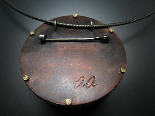
I finally finished this pendant. I had it almost done a couple of months ago and broke something. At that time I had to set it aside because I was so busy with getting ready for my December shows. Well, it is done now and I'm pretty happy with it. It was a custom order, intended for a large chain. I like the results and plan to adapt it to my usual chain size. Stay tuned for more triplet pendants.
 I'm also working on ideas for a new makers mark stamp. Currently I use a stamp with my initials that I designed. I really want to have my last name on my work so that someone would know who made the piece. Here is my current stamp, it is also too large to put on many items.
 I'm also working on ideas for a new makers mark stamp. Currently I use a stamp with my initials that I designed. I really want to have my last name on my work so that someone would know who made the piece. Here is my current stamp, it is also too large to put on many items.
Here are some ideas. What do you think about the font? Should I stick with the one that I already used before? I designed that one, and do like it. I found a website where you can design your own font that you upload into their website and then download onto your computer. I might try that too. It would be pretty cool to have your own handwriting as a font!


6 comments:
What if you did an a within an A? That would be kind of cool. It's fun playing with the letters. You could do an upside down A right next to a right side up one, and then continue your last name.
Now that I'm married my initials are KK. it'll be fun to design my stamp with the repeated initial.
I think I like the top one :)
I would stick with the same font, if you plan to continue using the other stamp. creates continuity.
I prefer the all lowercase aakers. Having your own handwriting as a font would be very cool.
I love the pendant!
KM, I have tried a bunch of different things like that and haven't come up with any that I like. I keep going back to just a simple one with my name in cursive.
Thanks for the feedback everyone! Andes, I think I agree I need to use the same font as the original, though I do like that font.
New pendant looks great. I like the lower case aakers. Will call this afternooon.
Post a Comment